
No dead ends, only solutions

Case Study

Context
Sharpen design prompt as part of the Google UX Design Certificate: "Design a tool to help women in danger or in precarious situations find solutions."
Project Overview

The project:
This initiative aims to design a digital tool (website and mobile app) to help women in precarious situations quickly find solutions, break their isolation, and progress toward social and economic autonomy. The mobile app and website also include an emergency SOS feature.

Project duration:
01/01/2025-12/01/2025


My role:
As the sole UX designer on this project, I held a generalist role with a variety of responsibilities.

Responsibilities:
- User research
- Competitive audit
- Information architecture
- Visual design
- Wireframing
- Usability testing
- Prototyping

The problem:
In France, many women in precarious situations (victims of domestic violence, social isolation, or administrative barriers) struggle to access the available resources and support services.

The objective:
To design a mobile application and website that improve access to support resources for women in precarious situations. We chose to focus primarily on the SOS emergency feature and aimed to enhance its efficiency and effectiveness.

Understanding the User
-
User research
-
Brainstorming ideas
-
Competitive audit
-
Personas
-
Problem statements
-
User journey map
-
User task and user flow steps
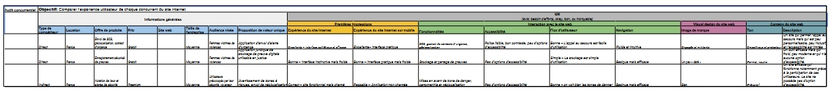
Research : Summary

There were four main phases:
-
User research: Through interviews and empathy maps helped us understand the needs of women in precarious situations.
-
Competitive audit: Identify the strengths and weaknesses of 3 main competitors.
-
Usability testing: Conducted during the low-fidelity prototype stage.
-
Second round of testing: Performed with the same users.

Research: Summary
After a brainstorming session, we conducted interviews and created empathy maps to better understand the future users of our app and website, along with their needs.
After analysis, we identified our primary user group as women aged 18 to 60.
We interviewed 5 women, including one who is deaf-mute: 2 women had no children, 3 women had children
2 women were married, 3 women were employed, 1 woman was a student, 1 woman was unemployed
This research helped surface key user needs, but we decided to focus specifically on the SOS emergency feature due to its urgency and importance.
User Research: User Pain Points
1
Sending an SOS in a single click
Users need to be able to send a distress call quickly
2
To have a website that is easy to use
In a dangerous and stressful situation, navigation must be intuitive
3
Accessing help even with a disability
Some female users face reading difficulties, language barriers, or sensory impairments.
Many support platforms do not take these user profiles into account, which can prevent them from accessing certain resources.
Brainstormed Ideas
-
Sending an SOS with one click
-
Sending an SOS without speaking (due to the situation, language, disability, etc.)
-
A discreet app to avoid alerting the abuser
-
An app that records location, ambient sound, and video
-
A website that offers numerous resources in one place
-
Voice-activated alerts with a customizable word or phrase
-
Camouflage display to send a discreet alert
-
Automatically notify a trusted contact at the same time as sending an SOS
-
Offline functionality: send alert when connection returns?
-
Pre-recorded medical and/or administrative profile with necessary documents
-
A chat system with professionals?
Competitive Audit
-
Compare the user experience of each competing website
Persona : Jennifer D.
Problem Statement:
Jennifer is a young single mother in a precarious situation who needs help to get by and offer a better future to her son.
User Story:
As a young single mother, I want to find help and resources so I can get back on my feet and give my son a better life.

Persona : Malika M.
Problem Statement:
Malika is a married woman seeking divorce who has linguistic and administrative difficulties and needs access to legal resources to get divorced and become autonomous.
User Story:
As a mother of three who wants a divorce, I want to be supported through the process so I can become independent.

User Journey Map: Persona: Jennifer D.

Goal: To provide her son with a stable and secure future by accessing psychological, financial, and educational support, while finding an opportunity for training or employment.

User Journey Map: Persona: Malika M.
Goal: To break free from dependence on her husband by accessing resources for divorce, protecting her children, and better integrating by learning French.

User task and user flow steps
User Task: Use the app to send an SOS
User flow steps from entry point to task completion within the app:
1. Click the SOS button
2. Click on "Police"
3. Click the OK button
4. Click the STOP button
5. Click the HOME PAGE button
Starting the Design
-
Paper wireframes
-
Digital wireframes
-
Low-fidelity prototype
-
Usability study
Paper Wireframes
Here are different iterations of the homepage with variations for screen sizes, including desktop, mobile, and tablet. Due to time constraints, paper-based iterations were not created for each screen. Instead, the iterations were made digitally after each design critique session.
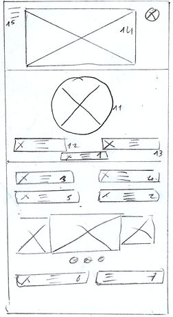
Key elements: 1 Emergency ; 2 About Us ; 3 Find Help ; 4 Online Services ;
5 Resources ; 6 Events ; 7 News ; 8 Partnerships ; 9 Private Space ; 10 Legal Notices ; 11 Emergency Call ;
12 Emergency Call; 13 Emergency Message ; 14 Logo ; 15 Menu
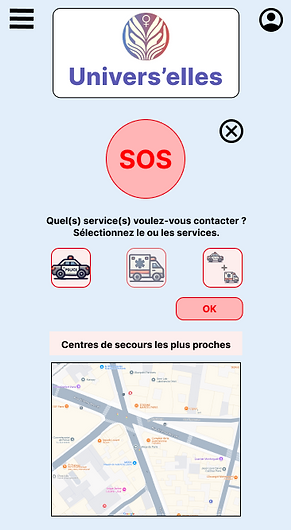
Digital Wireframes for Smartphone
Users will be able to send an SOS to the police and/or an ambulance from their smartphone, tablet, or computer. The ambient sound will be recorded and sent live to emergency services along with the device's location.

Les utilisatrices vont pouvoir envoyer un SOS.
Digital Wireframes
Digital mockup of the "Create with Artificial Intelligence" page in different screen sizes (desktop and smartphone) before the first user test.


Low-Fidelity Prototype
Here is the link to the lo-fi prototype. It’s the version used in the first user test.
Please focus on the SOS feature.

Usability Study: Settings

Type of study:
Unmoderated usability study

Participant :
5 participants

Location:
Istanbul, remote

Duration:
10 to 15 minutes
Usability Study: Results
I conducted two rounds of unmoderated usability studies with 5 participants. We wanted to evaluate the main functionality of this application, which is the SOS feature. We aim to improve this tool to make the emergency call as effective as possible.
Key performance indicators were Time to send an SOS, Conversion rate, System Usability Scale (SUS) score, User satisfaction
1
Rework the "Police / Ambulance" button
Users did not understand the
"Police / Ambulance ".
2
Rethink the term “Validate”
The term “Validate” for sending the SOS did not seem relevant.
3
Rethink the “Cancel SOS” button
Users were confused by the use of an X icon for the "Cancel SOS" button
Refining the Design
-
Design system
-
Mockups
-
High-Fidelity Prototype
-
Accessibility
Design system

Mockups
We took user feedback into account and modified the “Police and Ambulance” button design, and changed the “Validate” button to “OK.” This made the user flow simpler and easier to understand.
Before the usability study

After the usability study
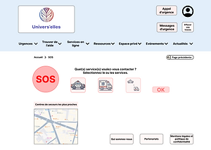
Mockups
Here are the mockups for the main user flow of the smartphone version.


Key Mockups
Key Web Mockups:Here are the mockups for the main user flow of the website version.


High-fidelity prototype of the application
Here is the link to the high-fidelity prototype. It only includes the main user flow!

High-fidelity prototype of the website
Here is the link to the high-fidelity prototype. It only includes the main user flow!

Accessibility Considerations
1
We paid close attention to typography. The font classification is sans-serif, which helps improve readability for people with reading difficulties, such as those with dyslexia.
We also carefully considered both the typeface and the font style choices.
2
The colors of texts, backgrounds, buttons, and other elements were carefully selected to create stronger emphasis, improving visibility for users with visual impairments and helping to facilitate a smoother user flow.
3
The chosen hierarchy will ultimately allow the use of accessibility tools such as TalkBack, which will be beneficial for users with visual impairments.
Responsive Design
-
Information Architecture
-
Responsive Layout Design
Site Map
This was the first version of the site map. It has evolved slightly since then.

Responsive Layouts
The designs for different screen sizes include mobile, tablet, and desktop. While smartphone and tablet versions remain similar, the desktop version highlights more options.
Mobile site

Tablet

Desktop

Going Forward
-
Key Takeaways
-
Next Steps
Key Takeaways

Impact :
Impact:The design aims to meet user needs, in its current form, it fulfills the need to call for help in case of danger.
Peer feedback excerpt:
"The app allows users to call for help discreetly. It could literally save lives. "

What I Learned:
What I Learned:
While designing this app and website, I learned that research, usability testing, and design critique sessions help challenge biases, broaden perspective, and continuously improve design through iterations.
Next Steps
1
Develop other sections and user flows of the app and website
2
Improve accessibility for users with disabilities
3
Conduct another round of usability testing to further develop and enhance the app and website
Let’s Connect

Email: feyziocan.uxdesign@gmail.com
LinkedIn: www.linkedin.com/in/feyzi-ocan
Website: https://www.feyziocanuxdesign.com/
Thank you
Thank you for taking the time to explore my project Univers’elles!
This is the third project I have completed.
There is certainly still room for improvement.
Feel free to contact me to share your feedback and suggestions.