
No dead ends, only solutions

Case Study

Context
Sharpen design prompt as part of the Google UX Design Certificate: “Design a mobile-web application for a judo club.”
Project Overview

The Project:
As part of the Sharpen prompt "Design a mobile-web application for a judo club", we created a new application for scheduling judo training sessions and competitions.
This is an app design project developed as part of the UX Design course provided by Google and Coursera.

My Role:
As the sole UX designer on this project, I held a generalist role that encompassed multiple responsibilities.

The Problem:
Judo practitioners want to easily find and schedule training sessions, camps, and competitions.

The Goal:
We aimed to create a new application to help athletes, primarily competitive judo practitioners, find and schedule training sessions, camps, and competitions based on location and date.


Here are screenshots from the beginning and end of the user flow.

Responsibilities:
Here are some of the responsibilities I handled:
- User research
- Competitive audit
- Information architecture
- Visual design
- Wireframing
- Usability testing
- Prototyping

Understanding the User
-
User research
-
Brainstorming ideas
-
Competitive audit
-
Personas
-
Problem statements
-
User journey map
-
User task and user flow steps
-
« Close-up » storyboard
-
« Overview » storyboard
Research : Summary

There were four main phases:
-
User research: Through interviews and empathy maps, we identified user needs—specifically judo athletes and parents of young athletes (such as scheduling needs, online procedures and documents, techniques, news, etc.).
-
Competitive audit: We analyzed four competitors to identify their strengths, weaknesses, and gaps.
-
Usability testing: Conducted during the low-fidelity prototype stage.
-
Second round of testing: Performed with the same users.

User Research: Summary
After a brainstorming session, we conducted interviews and built empathy maps to better understand the needs of future users of our app.
We identified competitive judo practitioners as our primary user group, with a strong focus on planning their training and competitions.
While other needs were identified, we chose to focus specifically on schedule planning for this version.
User Research: User Pain Points
1
Centralized information
There is no existing app that allows users to schedule both training sessions and competitions.
2
Searching for dojos
Users should be able to search by dojo name or by geographic proximity.
3
Reminders
Users want to set visual and/or audio reminders and be able to customize them.
Brainstormed Ideas
-
Review judo movements
-
Follow sports news
-
Access information about judo and judokas
-
Track training sessions and camps
-
Display grading (belt promotion) dates
-
Monitor competitions
-
Suggest muscle training and cardio exercises
-
Calorie calculation
-
Meal planning and recipe ideas
-
Self-care tips
-
Well-being activities
-
Agenda with visual and sound reminders
-
Track athletic progress
Competitive Audit
-
Objective: Compare the user experience of each competing website

Persona: Saïd Bouras
Problem Statement:
Saïd Bouras is a competitive judo athlete and physiotherapist who needs a mobile app to plan his preparation for judo competitions.
User Story:
As a senior judo competitor, I want to be able to plan my preparation in the best possible conditions in order to become the French First Division Champion.

Persona: Laurence Frété
Problem Statement:
Laurence is a 9-year-old girl who is just starting judo. She needs a mobile app to discover, learn, and review judo techniques, as well as stay informed about judo news.
User Story:
As a 9-year-old child starting judo, I want to be able to review techniques so that I’m ready for my belt grading exams.

User Journey Map: Persona: Saïd Bouras
Goal: As a senior competitive judoka, I want to be able to plan my preparation under the best possible conditions.


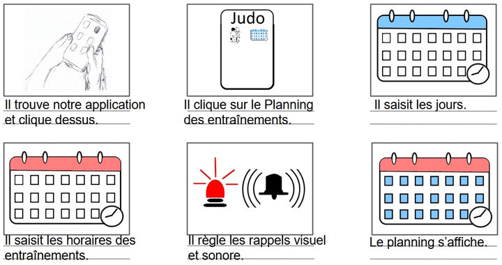
User task and user flow steps
User Task: Use the app to organize judo training sessions and facilitate weekly scheduling.
User flow steps from entry point to task completion within the app:
-
Open the application
-
Home screen
-
Tap on the "Training Schedule" button
-
Watch the tutorial? → Yes or No
-
If Yes → Start the tutorial | If No → Go to training schedule
-
Enter work hours
-
Enter judo training hours
-
Display the full schedule
-
Need visual and/or sound reminders? → Yes or No
-
If Yes → Set reminders | If No → Display schedule
-
Reminders are set → Display updated schedule
-
Return to the home screen

« Close-up » storyboard
Scenario: Saïd Bouras is a competitive judo athlete and physiotherapist who needs a mobile application because he wants to be able to plan his preparation for upcoming judo competitions.
« Overview » storyboard

Starting the Design
-
Paper wireframes
-
Digital wireframes
-
Low-fidelity prototype
-
Usability study
Paper Wireframes
Different iterations of the main screen were created. Due to time constraints, we did not create paper iterations for every screen.
Iterations were made digitally after each design critique session.
Key elements included:
Account
Alerts
Training schedule
Judo techniques
Judo news
Online procedures
Online documents
Search bar

Stars were used to mark the elements of each sketch that would be included in the initial digital wireframes.
Digital Wireframes
The absence of training times was a problem for scheduling.
Since then, the app design has evolved.

Users now have access to training times.
Additional features were added later.

Digital Wireframes
This wireframe was created following the first user test. Users had trouble understanding some button labels. Since then, the design has evolved again.
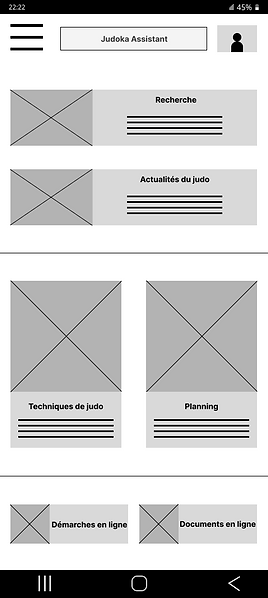
Labels are now clearer.

Low-Fidelity Prototype
Here is the link to the lo-fi prototype.
It’s the version used in the first user test.
We invite you to focus on the training schedule feature in this prototype.

Usability Study: Settings

Type of study:
Unmoderated usability study

Participants:
5 participants

Location:
Istanbul, remote

Duration:
15 to 20 minutes
Usability Study: Results
I conducted two rounds of unmoderated usability studies with 5 participants (3 women and 2 men, aged between 16 and 50). We aimed to determine, among other things, whether the core user experience, searching for and scheduling training sessions, was easy to complete. Key performance indicators were Time spent on the task, Conversion rate, System Usability Scale (SUS) score.
Conclusions from Round 1 : Lo-Fi Prototype
1
Users need access to judo training times to plan their schedules effectively.
2
Users need clearer guidance on the necessary steps to schedule training.
3
Users need more information on how to coordinate their judo and personal schedules.
Conclusions from Round 2 : Hi-Fi Prototype
1
Users could not locate the feature to plan personal life schedules.
2
Users need the ability to find nearby dojos or search for them by name.
3
Users want the ability to repeat weekly schedules when possible.
Refining the Design
-
Design system
-
Mockups
-
High-Fidelity Prototype
-
Accessibility
Design system

Mockups
Since users did not need the feature for scheduling their personal life, that option was removed.
Now, only the judo schedule remains.
Before the usability study
After the usability study


Mockups
Users can now search for one or more dojos of their choice, select a date, and view available training sessions and competitions.
Before the usability study
After the usability study


Key Mockups


High-Fidelity Prototype
Here is the link to the high-fidelity prototype. It only includes the main user flow!

Accessibility Considerations
1
We paid close attention to typography.
The font classification used is Sans Serif, which improves readability for people with reading difficulties such as dyslexia.
We also paid attention to the choice of font family and typeface.
2
Text, background, and button colors were selected to improve contrast and readability for visually impaired users, facilitating smoother user flow.
3
The visual hierarchy was designed to eventually support accessibility tools such as TalkBack, which is useful for users with visual impairments.
Judo is a para-sport with a large number of licensed athletes in France.
Responsive Design
-
Information Architecture
-
Responsive Layout Design
Site Map
This was the first version of the site map. It has evolved slightly since then.

Responsive Design:
Designs were created for different screen sizes, including mobile and tablet.
Mobile App

Tablet

Going Forward
-
Key Takeaways
-
Next Steps
Key Takeaways

Impact:
The design aims to meet user needs, in its current state, it addresses the scheduling needs of judo training sessions and competitions.
Peer feedback excerpt:
« This app will help judokas organize their training schedules more effectively. You should keep going and address the other user needs as well. »

What I Learned:
While designing the Judo Assistant app, I learned that research activities such as usability studies and design critique sessions helped challenge our assumptions, broaden our perspectives, and continuously improve the design through iterations.
Next Steps
1
Improve accessibility for users with disabilities.
2
Develop additional user flows, especially for completing administrative tasks online.
3
Add sound and video elements during navigation within the app.
Let’s Connect

Email: feyziocan.uxdesign@gmail.com
LinkedIn: www.linkedin.com/in/feyzi-ocan
Website: https://www.feyziocanuxdesign.com/
Thank you
Thank you for taking the time to review my Judo Assistant app project!
This was the very first project I completed.
There is certainly plenty of room for improvement.
Feel free to reach out and share your feedback or suggestions!